
Get professional responsive web design services from Web Designer India. Build fast, mobile-friendly and SEO-ready websites for businesses across India.

Your customers may visit your website from a mobile phone, laptop, tablet or desktop computer. Your website should look professional and work properly on every screen.
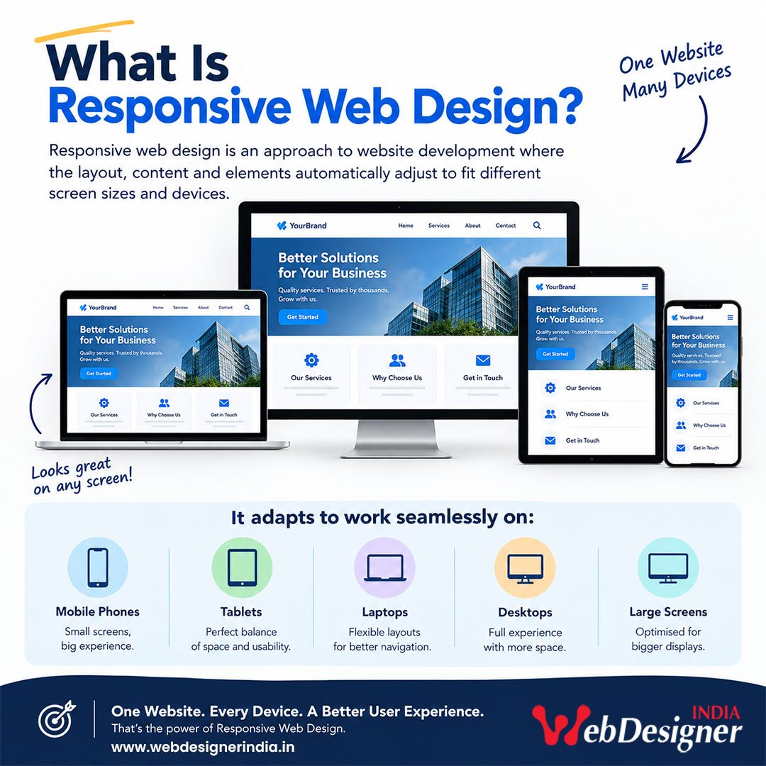
Web Designer India provides professional responsive web design services across India, helping businesses create websites that automatically adapt to different screen sizes and devices.
Whether you need a new business website, corporate website, ecommerce website, WordPress website or want to redesign an existing website, we create responsive websites with a focus on usability, performance, SEO fundamentals and business goals.
A responsive website does more than shrink a desktop website to fit a mobile screen. The layout, navigation, images, buttons, content and functionality should work naturally across different devices.
The same website can provide a suitable experience on:
Instead of creating a completely separate website for mobile users, responsive design generally uses one website and one URL while the layout adapts to the available screen space.
Google recommends responsive web design as a preferred implementation because it is easier to maintain and works with the same URL across devices.
For a business owner, this means your customers can access the same website whether they are searching from a smartphone while travelling, a laptop at work or a desktop computer at home.
A large percentage of website visits can come from mobile devices, and customers expect websites to work properly on their phones.
Imagine a potential customer finds your business on Google and opens your website on a mobile phone.
If the text is too small, the menu is difficult to use, images are cut off, buttons are hard to tap or the page takes too long to load, the visitor may simply leave.
A responsive website helps remove these unnecessary barriers.
Your website should make it easy for visitors to:
Good responsive design is therefore about how easily people can use your website, not simply whether the website technically opens on a mobile device.
A responsive website should not only fit different screens. It should also provide a good experience while the visitor interacts with the page.
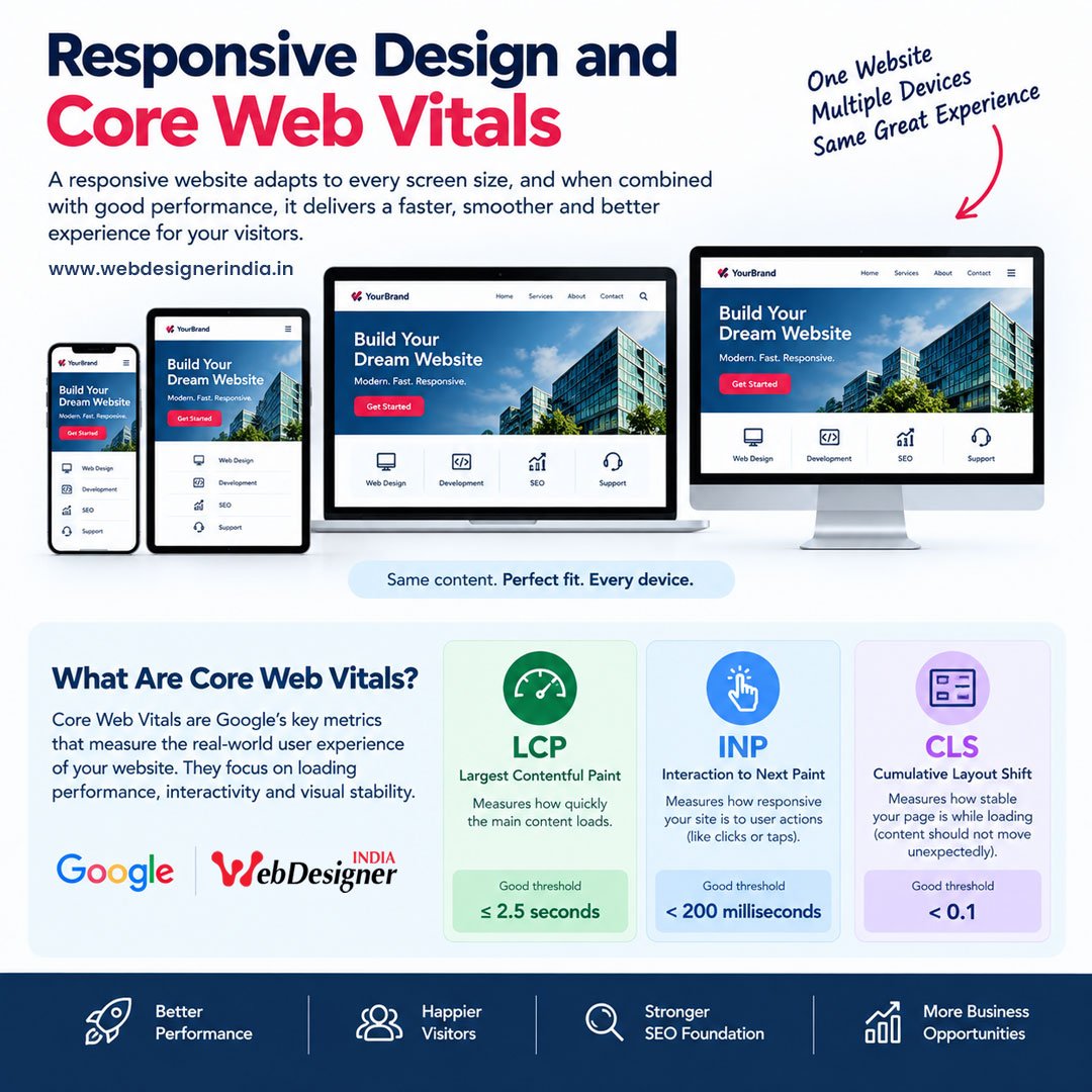
Google’s current Core Web Vitals focus on three key areas:LCP measures loading performance.
Google recommends a good LCP of 2.5 seconds or less.
This is particularly important for mobile users who may be accessing your website through a mobile network.
INP measures how responsive a page is when visitors interact with it.
Google recommends an INP of less than 200 milliseconds for a good experience.
This matters when visitors click menus, buttons, forms, filters or other interactive elements.
CLS measures visual stability.
Google recommends a CLS of less than 0.1.
A stable page reduces situations where content unexpectedly moves while a visitor is reading or trying to click something.
These metrics are part of Google’s page experience considerations. Good Core Web Vitals are recommended, but achieving a particular score does not automatically guarantee higher Google rankings.
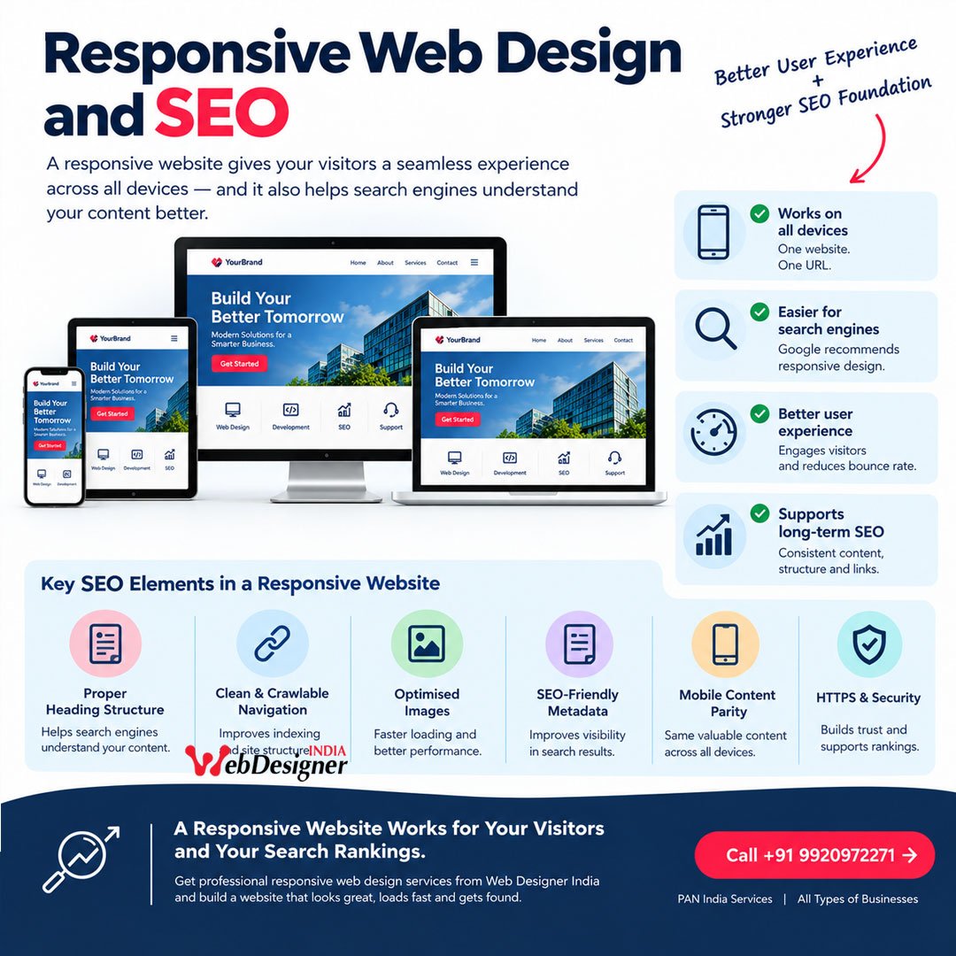
Responsive design is closely connected with modern SEO because Google uses the mobile version of a website for indexing and ranking.
Google recommends responsive web design because it allows the same URL and content to serve users across devices.
A responsive website can also make it easier to maintain:
This is particularly useful for businesses investing in long-term SEO Services.
However, responsive design by itself does not make a website rank on Google.
Search performance also depends on factors such as helpful content, relevance, technical accessibility, website quality, links, page experience and many other signals. Google recommends creating helpful, reliable, people-first content rather than content written primarily to manipulate search rankings.
Your website should make it easy for visitors to:
Good responsive design is therefore about how easily people can use your website, not simply whether the website technically opens on a mobile device.
Responsive design and website performance should be planned together.
A website can be responsive and still be slow.
For this reason, we consider performance-related elements during website planning and development, such as:
Actual performance depends on the complete website, hosting environment, plugins, third-party services, content and implementation.
For this reason, performance should be measured using real tools rather than promised as a fixed score before a website is built.

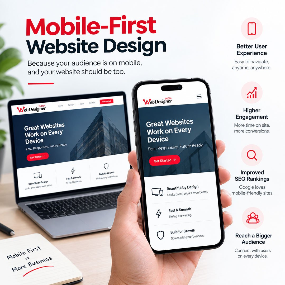
People often search for businesses from their smartphones.
That changes the way a website should be planned.
A mobile-first approach considers the smaller screen early in the design process rather than designing only for desktop and trying to fix the mobile version later.
Important information should remain easy to find.
Navigation should be simple.
Buttons should be easy to tap.
Forms should not be unnecessarily difficult to complete.
Images should be displayed appropriately.
Content should remain readable.
Google’s mobile-first indexing means the mobile version of a website is used for indexing and ranking, making mobile content and functionality particularly important.
A good responsive website should provide more than a flexible layout.
It should combine:
The page structure should adjust naturally according to screen size.
Text should remain comfortable to read without excessive zooming or horizontal scrolling.
Visitors should be able to move around the website without struggling with menus or buttons.
Important calls to action should be easy to identify and tap.
Images should be appropriately sized and optimised for the context in which they are displayed.
Your logo, colours, typography and overall brand identity should remain consistent across devices.
Visitors should quickly understand what action they can take, whether that is calling, submitting an enquiry, requesting a quotation or purchasing a product.
Content should not unexpectedly jump around while the page loads.
The website should be built with performance in mind rather than adding unnecessary visual effects simply because they look attractive.

Web Designer India provides responsive website design and development for different business requirements.
Professional websites for businesses that want to present their company, services, products, expertise and contact information online.
Structured websites for established companies that need a professional digital presence across multiple departments, services or business areas.
Responsive WordPress websites designed for businesses that want a flexible content management system.
Mobile-friendly ecommerce websites where customers can browse products, view categories, add products to their cart and complete the required purchase process.
If your existing website looks outdated or does not work properly on mobile devices, we can redesign the website with a modern responsive structure.
Conversion-focused landing pages designed for advertising campaigns, lead generation, specific services or promotional campaigns.
Suitable for designers, photographers, consultants, agencies, professionals and businesses that need to showcase their work.
Designed for service-based businesses that need to explain their services clearly and generate enquiries.
We provide responsive website design services for a wide range of industries and business models.
Our website design services can be suitable for:
The website structure is planned according to the business rather than forcing every client into the same design.

There is an important difference between a website that technically opens on a phone and a website that has been properly designed for mobile users.
A basic mobile-friendly website might simply reduce the size of desktop elements.
A properly planned responsive website considers:
Screen size → Content → Navigation → Images → Buttons → Forms → Performance → User journey
For example, a desktop navigation menu with eight or ten items may need a different presentation on mobile.
A three-column service section may become a single-column layout.
Large desktop banners may need different image proportions.
A multi-field enquiry form may need to be simplified.
These decisions make the website easier to use.
you can contact our team to discuss your website requirements. We also work with businesses that prefer remote communication through phone calls, email, online meetings and digital project coordination.
Our service area is PAN India. You do not need to be located near our office to work with Web Designer India.
Choosing a web design agency is a business decision, so it is important to look beyond attractive screenshots.
We work on websites for different types of businesses and requirements, from business websites and service websites to ecommerce and WordPress projects.
Responsive behaviour is considered as part of website planning rather than treated as an afterthought.
Website structure and SEO should work together. We consider important SEO fundamentals during website development.
The purpose of your website is not simply to look attractive. It should help visitors understand your business and encourage relevant actions.
The website is planned for visitors using mobile phones as well as larger screens.
Page speed and user experience are considered during development, including areas related to Core Web Vitals.
You can work with our team from anywhere in India.
Website requirements do not end after launch. We can also help with website maintenance, SEO and future improvements.
Before choosing a responsive website designer, ask:
A good website project should answer these questions before development is completed.
Tell us about your business, the type of website you need, the features you want and your current website if you already have one.
Our team can understand your requirements and suggest a suitable responsive website approach.
Request a Website Design Consultation
Call: +91 9920972271
Serving businesses across India | PAN India Responsive Web Design Services
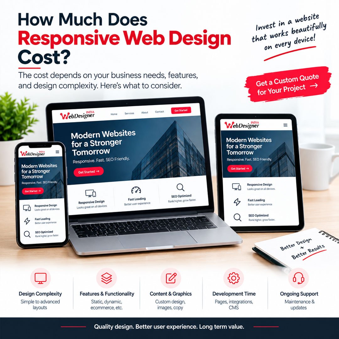
There is no single price for responsive website design because every website has different requirements.
The cost can depend on:
A simple business website and a large ecommerce website require very different levels of planning and development.
Instead of choosing a package based only on price, we recommend discussing your actual requirements so the website can be planned accordingly.
The time required depends on the size and complexity of the project.
A small business website may require significantly less time than a large ecommerce website with hundreds of products, custom functionality and third-party integrations.
The project timeline can also depend on how quickly content, images, branding material and feedback are provided.
Before starting the project, we can discuss the expected stages and approximate timeline based on your requirements.
Requirements gathering
Website Prototype Design
Website Coding & Testing
Launch, Beta Live, & Live
Monitoring & Support
Get a professional, mobile friendly and SEO ready website designed around your business goals and built to turn visitors into customers.
Posted on Google
 amit more
Trustindex verifies that the original source of the review is Google.
Mene innse SEO ka kaam karwaya hai mujhe inhone 3 mahine me itna aacha results diye hai mere website me traffic bohot saare aane lage unhone mere se 3 mahine ka time manga and unhone kaam bohot aacha Kiya hai thank web designer india seo ka kaam app logo ne bohot aacha Kiya haiPosted on Google Acharya DiyaReally happy with the experience with Web Designer India. The team is professional, creative, and understands the requirements properly before starting the project. They created a modern, responsive website for us and were very supportive throughout the development process. What I liked most was their attention to detail, communication, and willingness to make improvements based on our feedback. If you’re looking for a reliable web design company in Mumbai for a business, WordPress, or eCommerce website, I would definitely recommend Web Designer India. 👍Posted on Google
 Akash VermaI’m really happy with the website created by Web Designer India. They designed a 16-page informational website for me, and the final result looks professional, clean, and easy to use. The team understood my requirements well and made sure every page was properly designed and responsive on mobile and desktop. They were also supportive and quick to respond whenever I needed any changes. Great work and highly recommended for professional website design!Posted on Google
 Ram RamI’m very happy with the website created by Web Designer India. They built an 8-page informational website for me, and the overall experience was really good. The website looks clean, professional, and works well on mobile and desktop. The team understood my requirements and completed the work properly. They were also responsive and helpful throughout the project. Highly recommended for anyone looking for a professional website at a reasonable price.Posted on Google
 Jonathan MondalI got my ecommerce website made by Web Designer India and I am really happy with their work. The website looks good and works smoothly. The team was helpful and made the changes I asked for. They also gave good support during the project. Overall, I had a good experience and would recommend themPosted on Google
 Gulab PatelVery creative team with strong technical knowledge.Posted on Google
 Suraj jamdarWeb design agency in mumbai
Responsive web design is an approach where a website's layout and elements adapt to different screen sizes so visitors can use the website comfortably on mobile phones, tablets, laptops and desktop computers.